Many Covers Monday: Under The Never Sky
Today we're looking at the many different covers of Under The Never Sky and choosing a winner! These won't be the complete collection of covers, just as many as I can find or the most interesting from around the world.
WORLDS KEPT THEM APART.
DESTINY BROUGHT THEM TOGETHER.
Aria has lived her whole life in the protected dome of Reverie. Her entire world confined to its spaces, she's never thought to dream of what lies beyond its doors. So when her mother goes missing, Aria knows her chances of surviving in the outer wasteland long enough to find her are slim.
Then Aria meets an outsider named Perry. He's searching for someone too. He's also wild - a savage - but might be her best hope at staying alive.
If they can survive, they are each other's best hope for finding answers.
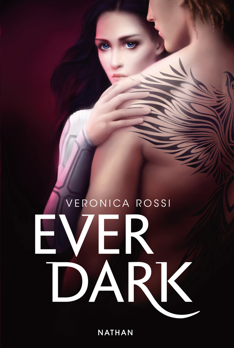
Book Depository ¦ Amazon UK/US ¦ Goodreads
UK Readers: Check if this book is on RISI
UK Readers: Check if this book is on RISI


Left: UK
Likes: The colours are lovely and are really eye catching too.
Dislikes: There's something really weird about this cover, which is probably the weird flying muscular man and ghost girl. It's not a cover that appeals to me at all. There's also the hint (bit more than a hint) that the story is going to be heavily romance based. It's worth noting that there's no matching cover for the sequel of this.
Right: US
Likes: Bad guys don't look at explosions... and bad girls don't look at creepy viney lightning things. This cover is seriously cool and I love the cloudy blue texture.
Dislikes: Not a whole lot, I think the space above her head could have been used better but that's just being picky.


Left: French
Likes: Oh my gosh, I love this cover. It's worth clicking on it because her eyes are so pretty. There's lots that I love about this cover, from the lightning in the background to her clothes giving the subtle hint that's futuristic and the gorgeous font. The sequel has a gorgeous matching cover too but I couldn't find a match for a final book.
Dislikes: Not a dislike, just confusion - this French cover is in English, which I haven't seen before. Odd!
Right: UK
Likes: The font is nice and the colours are lovely. The whole thing makes me think of a scorching desert.
Dislikes: You can't see her face and she's standing really weirdly. She kind of looks like someone's just shot her in the back and she's about to fall to the ground, movie style.


Left: Dutch
Likes: The font is really cleverly done and immediately catches my eye.
Dislikes: Whatever that face thing/border is. Does nothing for me.
Right: Greek
Likes: The sky is nice.
Dislikes: This looks like a bad 90's CD cover and I hate it. The dress takes up like 65% of the entire freaking cover and just no.


Left: German
Likes: It's a simple cover but very eye catching, the big glowing A is definitely the focus.
Dislikes: That A is seriously, seriously big.
Right: Spanish
Likes: I do like covers with trees on them so that ticks this box. It's a creepy cover, if not obviously dystopian like some of the others.
Dislikes: Not sure about the yellow font choice.
Winner

I love digital art on covers and this is just so. cool. It's simple but very effective.
Vickie x


I have to agree with your winner. I was however very bummed about the cover change. I owned the first UK cover just to find that book 2 and 3 where nowhere to be found with matching covers. I do now own the new UK covers and I love how to look on my shelves. They are a good second place.
ReplyDeleteThe cover on the left that is paired up with the Greece cover is Dutch, not German ;) I'm not sure why the A is so big on the German cover, but I really like that one! It's together with the UK my favorite.
ReplyDeleteSorry, will fix that now. Thank you!
DeleteMy favourite has got to be the first UK one!
ReplyDelete